Escaping the Strange Loop
A multi-modal interactive installation transforming complex climate data into a tangible, team-based experience.
Client
EUROfusion / CIID Research
Year
2019
Role
Interaction Lead & Systems Architect
The Challenge: Humanizing Fusion Energy
EUROfusion needed a way to make the abstract data of fusion energy and climate policy tangible for the general public. My challenge was to lead the interaction design for a "looping" timeline experience, translating dense scientific models into an immersive, three-part narrative journey through the years 2050, 2080, and 2100 .
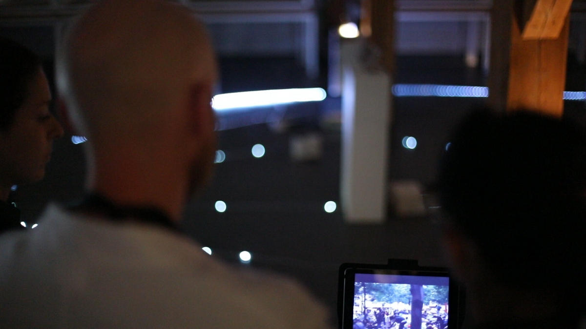
Participants gather around a dimly lit loop of LED markers in the exhibition hall, peering at a tablet that streams real-time projections of future energy scenarios—evoking the immersive, game-like environment of Escaping the Strange Loop.
Data Visualization: The Narrative Interface
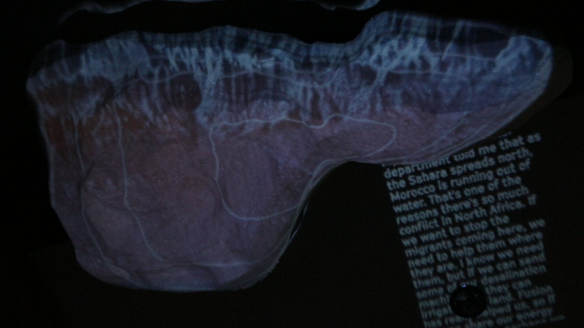
I developed a series of circular D3.js visualizations that floated over live participant video, acting as the primary interface for branching story paths . This "Augmented Reality" approach allowed participants to see their own influence on the data in real-time. I paired this with large-scale projections of environmental policy vignettes to ground the data in human stories .
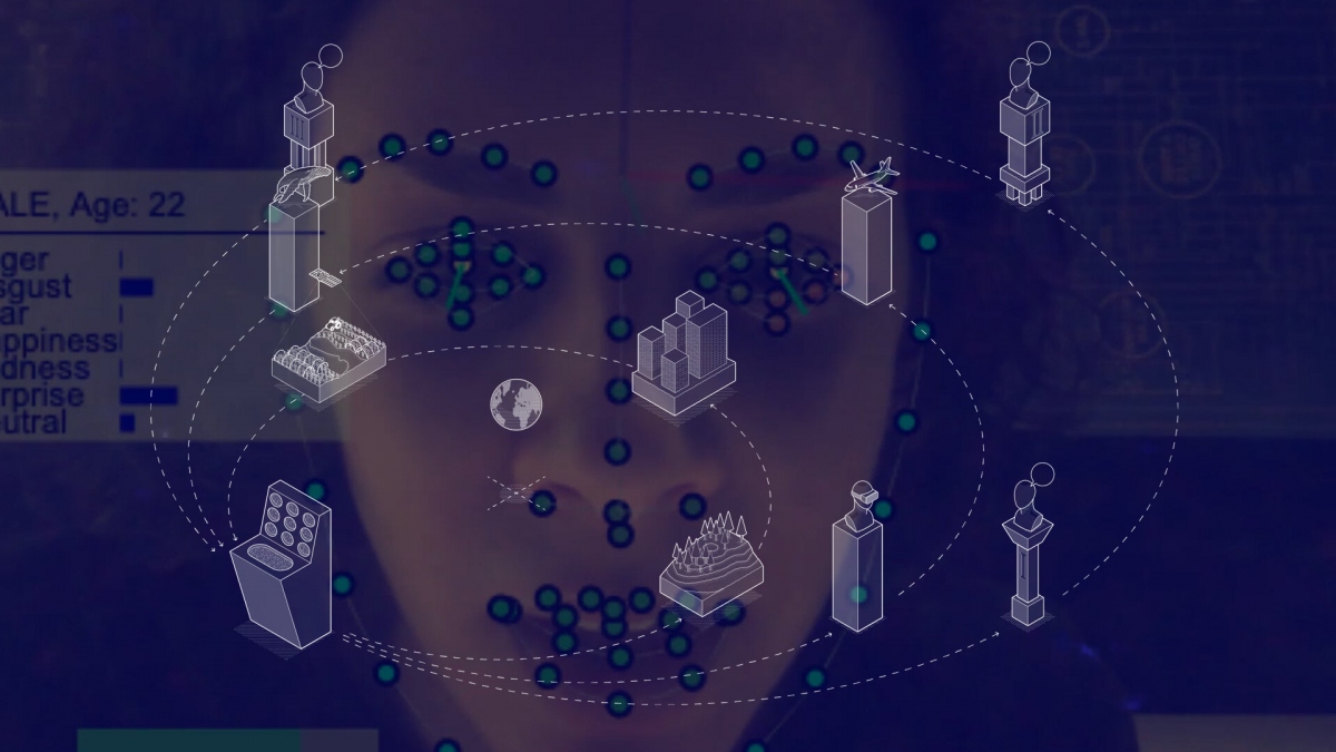
A circular d3.js visualization of eight energy-policy artefacts floats over a live video of a participant, illustrating the branching scenarios teams navigate at each mission node under the AI guide GAIA.
Tangible UX: The Mission Consoles
To move beyond passive observation, I designed and built custom Arduino-powered mission consoles . Using physical ID badges as a login mechanic , I created a tactile "confirmation" loop for collective decision-making. This tangible interaction ensured that every policy choice felt heavy and deliberate, bridging the gap between digital data and physical consequence.
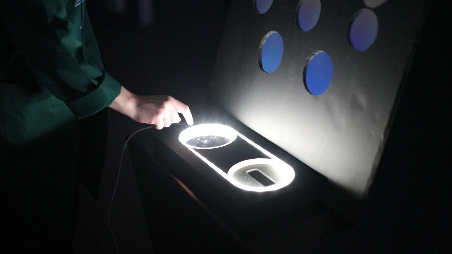

One of the mission consoles in action: a visitor presses a capacitive pad next to projected circular icons, activating the next animated scenario slice in the loop of 2050, 2080, and 2100 missions.
Systems Architecture: Syncing the Loop
Managing a touring installation required a robust technical backbone. I architected a Node.js narrative engine that synchronized media projections, D3.js interfaces, and physical sensor inputs across eight distinct nodes . This "offline-first" local network ensured zero-latency responses, which was critical for maintaining the participants' immersion in the 20-minute experience.

Vector diagram of the full circular layout showing eight distinct policy artefact nodes orbiting a central globe—used in design documents to map physical placement and narrative flow across the three mission loops.
Iterative Prototyping: Pacing & GAIA
Early user testing revealed significant cognitive overload. To solve this, I introduced 'GAIA,' an AI-guide narrative layer that managed the pacing of the decision loops. By reducing the scope from four loops to three and adding this guiding "voice," we significantly increased participant completion rates and deep-thought engagement with the energy trade-offs.
Outcome: A Global Conversation Piece
The installation toured multiple European cities, engaging thousands of scientists, students, and policymakers. The project culminated in a "holographic" centerpiece I prototyped—a glowing light sculpture that visualized the cumulative impact of the team's decisions . It successfully turned complex climate statistics into a visceral, emotional memory for participants, earning multiple international design honors.

The central “hologram finale” prototype—a clear acrylic cube with etched concentric lines—emits light to form a low-fi planet model, visualizing the cumulative impact of each team’s energy choices.
