Loofers
An app for prize draws on real products, under a Danish online casino licence, live in the App Store. I was hired to port it to React Native. I rebuilt it, and redesigned the parts that were quietly broken: how you buy a ticket, how you learn the app, and how you find out if you won.
Client
Numen
Year
2026
Role
Design Engineer
The Rebuilt App, in Numbers
Measured in the new app, October to November 2026.
- 9 in 10
- new accounts buy a ticket in the session they register
- 10 sec
- from buy sheet to bought ticket, median
- 1 in 2
- visits to a prize page end in a purchase
- 3 in 4
- ticket buyers watch the draw
The Brief
Loofers runs prize draws for real products under a Danish online casino licence. You buy numbered tickets for a prize, with money or Loofers coins. Then you play a mini game to qualify them: your place on the scoreboard decides whether your ticket makes the draw. Then one number wins.
It existed as a native iOS app, built from an agency design that was years old. I was hired in April 2026 to port it to React Native. A straight port would have shipped every decision in that file again: one phone size, no states, no motion, no components, and a buy flow that takes a full screen of numbers to get through.
So I rebuilt it screen by screen and fixed what was broken on the way through. I built the entire client app. One colleague built the backend, another handled planning and compliance.
The home screen
The first screen a new visitor sees, scrolled from top to bottom and back.
Three Problems, Three Fixes
Three parts of the old app worked and still let people down: buying a ticket, learning the app and finding out if you won. Nobody had flagged them. I fixed them as I rebuilt the screens they were on.
Quick buy
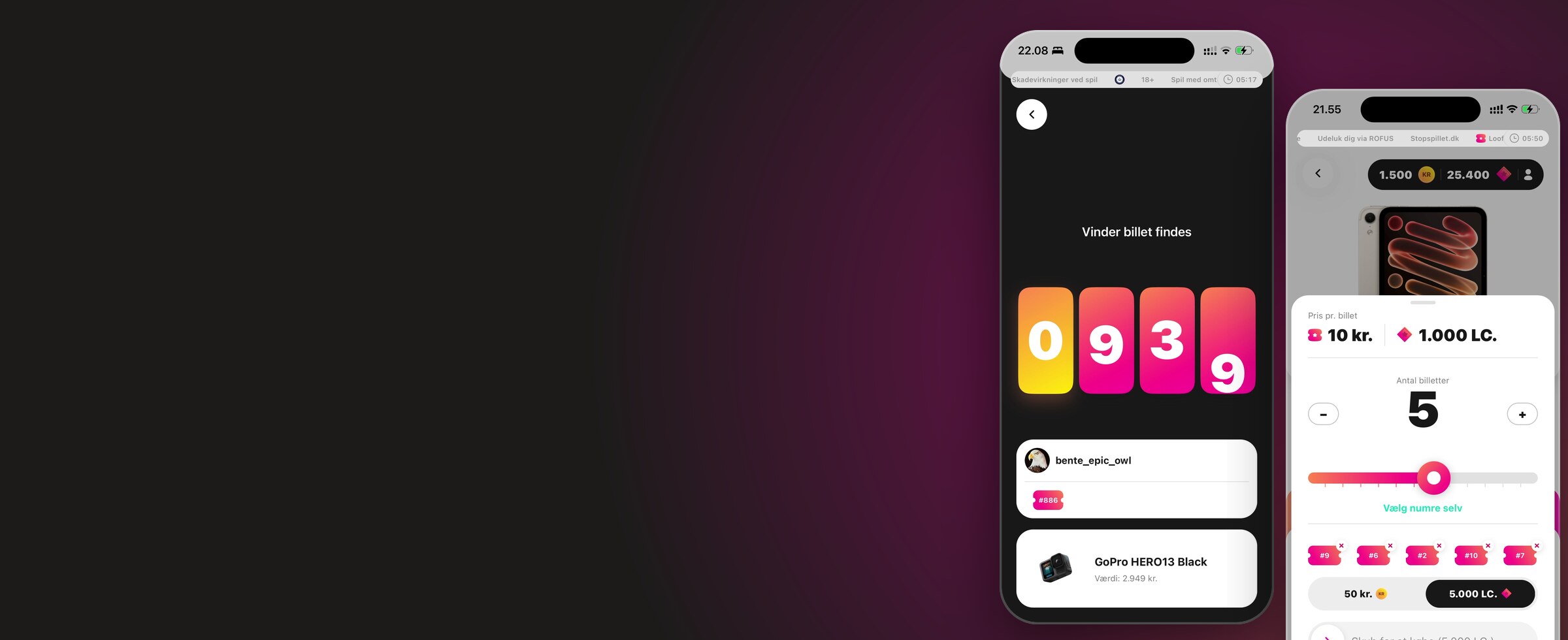
The old app made you pick every ticket number by hand from a full-screen grid, press buy, then confirm in a dialog. Most people do not care which number they get. I replaced it with a sheet: a slider for how many, a swipe to confirm. The grid is still there for the people who care, one tap away. The median purchase takes 10 seconds from opening the sheet, and half of all visits to a prize page end with a ticket bought.
Buying five tickets
The tour
The app has a lot to explain before a first purchase: two currencies, numbered tickets and a game that qualifies them. So I built a nine-step tour that crosses four screens and a sheet. The spotlight sits on the real control and you advance by using it: tap the actual wallet, drag the actual slider, swipe the actual confirm. No tooltip carousel. It survives navigation, recovers if you wander off and can be replayed. 9 in 10 new accounts buy a ticket in the session they register, a median of two minutes after signing up.
The draw
Everything in Loofers leads to one moment: a number is drawn and somebody wins a watch, a bag, a phone.
I rebuilt it in three acts. A 3-2-1 countdown, a slot machine that lands the winning number one digit at a time above the tickets you hold, then the winner. The server has already decided. The app reads your tickets and picks the order the reels stop in. Hold 1546 against a winning 2576 and the 5 lands first, then the 6, and you are in it until the third reel stops.
Nobody asked for it. 3 in 4 ticket buyers watch a draw, and two thirds of them come back for the next one.
Winning a draw
Before, a list of names rolled past and stopped on the winner. Now a countdown, then the winning number lands one digit at a time above the tickets you hold.
Sign-up, Top-up, Wallet
Sign-up is where a gambling app loses people, and most of it is not ours to design. Danish gambling law requires us to know who you are before you can play, so the form has to collect a name, an address, a CPR number, a MitID verification and a deposit limit. That is why it is as long as it is.
So I measured it. I tracked every step, built the funnel and read the drop-off release by release. The biggest leak was not a step. It was an error: MitID rejecting a name that did not match the national register. 51% of the people who hit it gave up. I added a hint for which name to type, and two releases later it was 29%. Over the same releases, the share of people who start MitID and end up with an account went from 74% to 78%.
I cut the second password field. I also tested three versions of the copy on the CPR step. None of them moved anything, so it stayed as it was. The whole form takes a median of two minutes and hands straight over to the tour.
Signing up
The full flow from the first screen to a verified account: name, address, contact details, password, MitID and deposit limits. The rebuild ends on the first step of the guided tour.
Topping up
Choosing an amount on the dial and paying. Personal details are blurred.
The profile
Before, balance and settings in one tab. Now the balance pill opens the wallet, where the kroner and Loofers coins cards drop in, and the profile is one tap further.
New in the rebuild
A tab for the draws that are about to close, each with its own countdown.
The Home Screen, Taken Apart



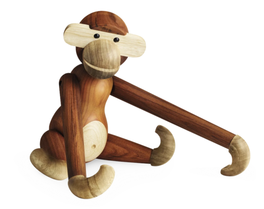
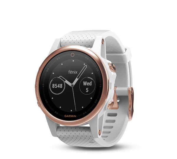
Compliance bar
Danish online casino rules ask for an 18+ notice, responsible-gambling information, ROFUS, the regulator's mark and a visible clock. This one strip carries all of it, on every screen, including sign-in and the games. The old one bounced its text left and right. I made it a marquee and pinned the session clock to the end. Nobody puts that in a brief, and everybody notices when it is wrong.
The old design had no system under it. The Figma file was a transcription of a static XD document: no variables, no components, no auto layout. Porting it as drawn would have meant copying hundreds of one-off colours and sizes into code.
So I built the design system it never had. Colours, type, spacing and shadows are semantic tokens: a button asks for accent, not for pink-500. Every part of the home screen above is a component built on them.
The benefit shows when something changes. A new palette is one edit instead of a hundred, and a new screen is assembled from parts that already behave correctly.
Games Without App Releases
The mini games were compiled into the app. A new game, or a one-line fix to an old one, meant a build, a store review, a phased rollout, and a long tail of people on old versions who never got it.
I proposed moving them out, wrote the spec and built the first version of the game server. Games are now standalone builds written against a custom SDK, uploaded to the server and opened inside the app.
Shipping a game went from a release cycle to an upload, and everyone gets it the next time they open the app. The old app had two games. The rebuild has eleven, and the people who play average about ten rounds a week. I built the new ones together with freelancers, and at least six more are on the way.
From two games to eleven
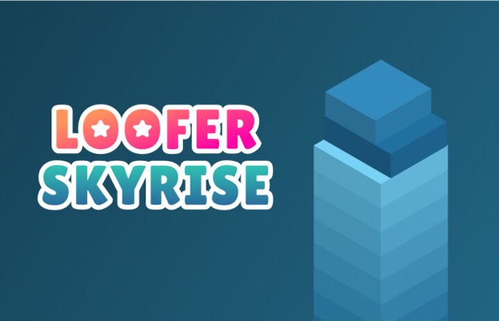
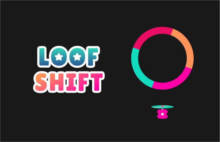
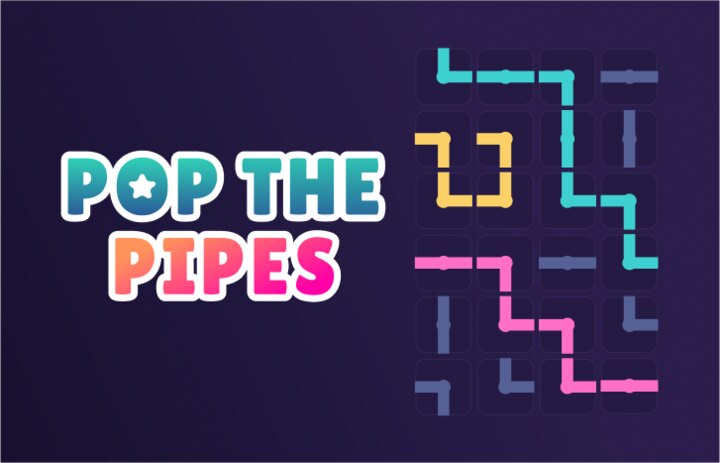
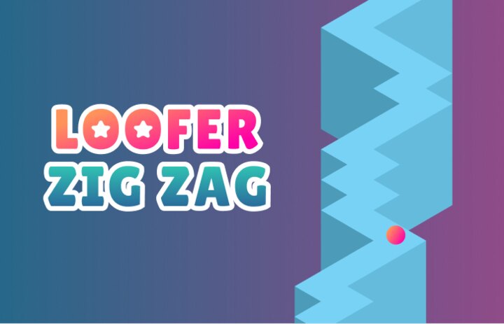
Whack a Loof and Loofer Copter came over from the old app. The other nine are new.
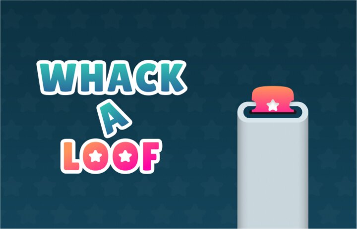




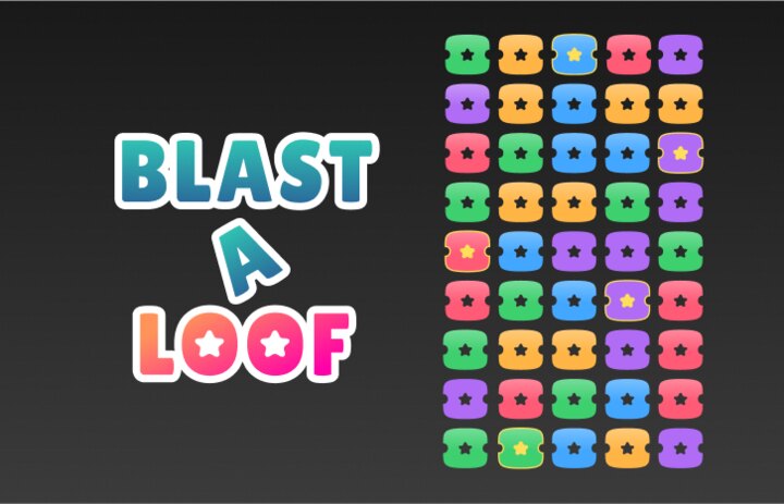

Playing a game
Opening Loofer Copter from the games tab and playing a round. In the rebuild the game comes from the game server, not from inside the app.
The Part I Have Complicated Feelings About
The reveal is choreographed against your tickets so you stay in it as long as possible. That is a near-miss mechanic. It is one of the best-studied effects in gambling research and it is not neutral. I knew that when I built it, and it works as well as the research says.
I am not going to pretend I did not build it. What I did was give the exits the same budget as the entrances. Danish rules require the basics: a deposit limit set before you can play, self-exclusion and a visible session clock. I built those, and then the parts the rules do not ask for. The clock reads from a trusted source, so changing the phone's time does nothing. Deposit caps are enforced on the server, not only in the app.
Building the thing that stops people is as much design work as building the thing that converts them.
Losing a draw
The same draw when you do not win. Before, a result screen. Now you watch the number land on someone else's ticket.
The Rebrand
This one has just started, and it is still exploration. By launch the product worked and the look did not. Loofers read as a friendly mobile game, and next to a photo of a Chanel bag it made the bag look fake.
The rebrand starts from one test: does the home screen make the bag look more expensive, or less? Prize names in a serif, the interface in a quiet grotesk. Product photos on stone, with room to sit. Hairlines instead of cards. No gold on black, no glass for the sake of glass. The brand pink exactly once per screen, on the thing that is live.
The home screen is the first piece and is in the prototype below. The prize page and the draw are next.
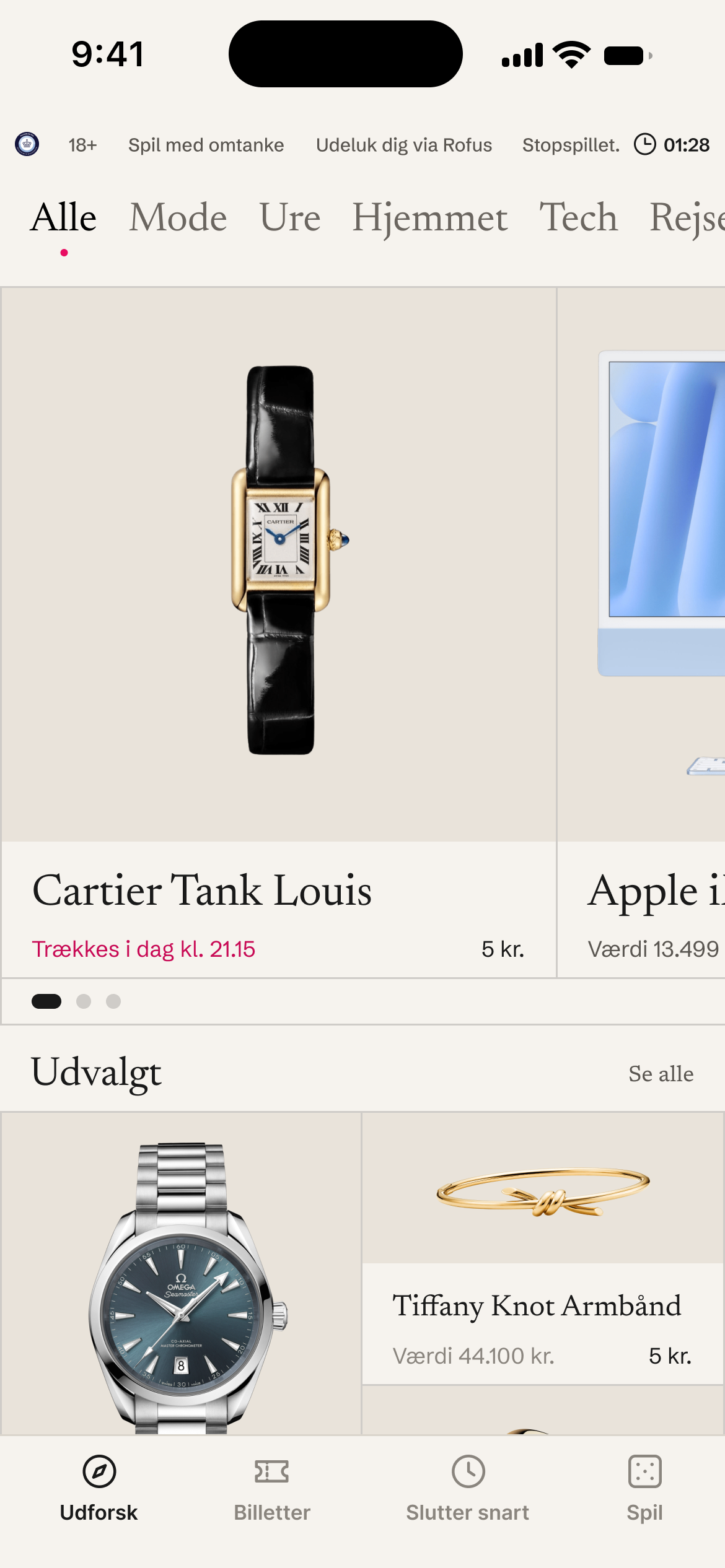
The redesigned Loofers home screen from the rebrand: prize names in a serif, product photos on a stone surface in an edge to edge hairline grid, the compliance strip at the top, and the brand pink used once for the live draw.
Outcome
The rebuild went live in the App Store in September 2026, and in November I took over tech and product. The rebrand and at least six more games are next.
What I would do differently is push on the design earlier. I accepted "we already paid for it" for longer than I should have. What worked was shipping a small improvement and letting the result argue. It worked every time I tried it. I did not try it often enough.